Why Does My Web App Look Fine on Desktop but Awkward on iPhone?
If you're a web developer or product owner, you might have faced this all-too-common scenario: your web app looks perfectly polished on desktop browsers but suddenly feels off, cramped, or just plain awkward when you open it on an iPhone. You aren’t alone in this. Apple’s ecosystem, especially Safari and WebKit — the engine powering it — has unique behaviors and constraints that can trip up even seasoned web authors.
In this post, we'll unpack why seemingly simple websites with responsive design for touch, good button reachability on mobile, and text readability on small screens can still look weird on iPhone. We’ll also explore important changes Apple introduced with Safari 26 and how Home Screen web apps now open as “standalone web apps” by default. These changes elevate browser-first web apps to feel more app-like without App Store installs, but they come with nuances you need to understand.
The Common Problem: Perfect on Desktop, Awkward on iPhone
First, let’s be clear: desktop and mobile browsers are fundamentally different environments, even when you use seemingly “responsive” layouts. It’s far more than just fitting content to a smaller screen.
Responsive Design for Touch is More Than Just Resizing
A page that adapts fluidly to different screen sizes (via CSS media queries or flexbox layouts) is just one piece. On desktop, user input is typically mouse and keyboard; on iPhone, it’s your fingers. Things like button reachability on mobile become critical. Touch targets need to be large enough and comfortably spaced so users don’t miss taps or accidentally hit the wrong elements.
Apple’s recommended minimum touch target size is 44 CSS pixels square — a number that’s easy to overlook when focusing only on layout. Moreover, iPhone users often operate their device with one thumb, so reachable screen areas concentrate more ergonomically toward the bottom and sides.
Text Readability is Different on Small Screens
On desktop, you can cram more text per line without readability suffering too much. But on smaller iPhone screens, lines that are too wide or fonts that are too small make reading a chore. Plus, Apple’s Safari applies some default font scaling and zoom behaviors that can conflict with your styles.
Safari 26: A Turning Point for Home Screen Web Apps
Here’s where things get interesting: with the recent release of Safari 26, Apple's default behavior for websites added to the iPhone Home Screen changed significantly. Now, Home Screen bookmarks open as standalone web apps by default — no browser chrome, no URL bar, and minimal UI elements.
Safari is a front-end for WebKit, the underlying engine Apple develops open source. WebKit’s push for better web app experiences on iOS means this “app-like” launch mode doesn’t require any special installability requirements beyond adding the link to your Home Screen and having (optionally) a web app manifest.
No Special Installability Requirements for App-Like Launch Behavior
Contrary to what some guides or presentations might imply, the standard requirements for getting your site to launch as a web app on iPhone haven’t changed dramatically:
- You just need users to add your site to the Home Screen manually — there’s no auto-install prompt like Android’s “Add to Home Screen.”
- Safari 26 then opens these shortcuts “standalone” by default — giving that app feel without a browser interface.
This is big because previously, some assumed that you *must* have a full manifest and all installability flags passing — but on iPhone, those are less rigid. That said, does this mean manifests and other PWA tech don’t matter anymore? Not at all.
Manifests and Service Workers Still Matter for Richer Experiences
Even with Safari 26’s hassle-free standalone web app launch, manifests and service workers remain crucial:
- Manifest files provide metadata such as your app’s name, icons, theme colors, and preferred launch screen orientation.
- Service workers enable powerful offline capabilities, caching strategies, and background syncing.
Without a manifest, iOS tries to infer a lot but can’t guarantee ideal app icon visuals or full control over the launch screen experience. Skipping service workers means your app will always reload content robservatory.com from the network or cache in predictable but sometimes less performant ways.
These components collectively transform a "just a website" feeling into a smoother, more app-like experience that users expect from native apps — even if the user never taps “install” from an app store.
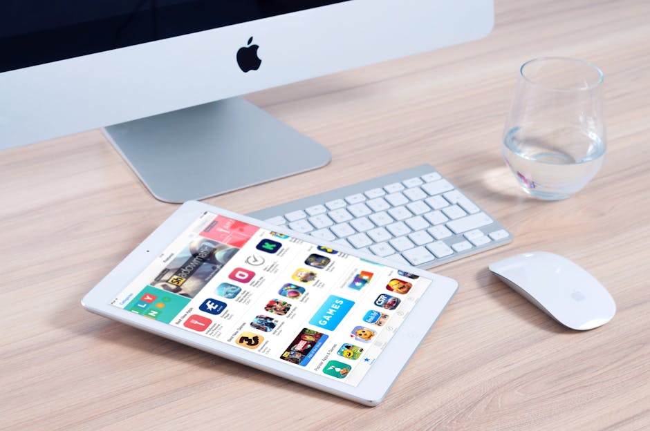
How Browser-First Services Feel App-Like Without App Store Installs
For over a decade now, web developers have been pushing the envelope with Progressive Web Apps (PWAs), unlocking app-like features on browsers without requiring users to download from the App Store. With Apple’s recent changes, that promise is closer to reality than ever on iPhone.
The lack of friction in launching Home Screen web apps standalone means your service can juggle:
- Full-screen, distraction-free experiences without browser UI.
- Offline support and fast loading through service workers.
- Fresh icons and splash screens defined in your manifest.
- Push notifications and background features where supported.
All this without compromise to discoverability or convenience. Users can start using your service just like a native app — no App Store install required.
Common iPhone Design Pitfalls to Check Next
You’ve grasped the platform behavior, but why is your app’s layout still awkward on iPhone? Here are the usual suspects:
- Viewport Meta Tag Misconfiguration: Always include to ensure correct scaling and zoom.
- Touch Targets Too Small or Crowded: If buttons or links are below 44x44 CSS pixels or jammed together, users will find your app frustrating.
- Ignoring Safe Area Insets (Notch and Home Indicator): Modern iPhones have rounded corners and home indicator bars you must accommodate via CSS env() variables.
- Fixed-Width Layouts: Avoid hard-coded pixel widths; prefer fluid layouts with % or viewport units to adapt naturally.
- Font Sizes Too Small: Use at least 16px base font size to avoid automatic zoom behavior by Safari that can break layout.
Testing on Real Devices Is Key
One frustration I personally face as a mobile web product writer and developer is the "it just works" trope. Apple's ecosystem changes subtly and often without explicit public announcements. For example, the transition in Safari 26 to default standalone open mode left many developers confused until they tested on real iPhones.
My advice: always keep a folder of Home Screen app icons on your devices to test launch behavior and icon rendering firsthand. Desktop simulators or browser device emulators rarely capture these quirks perfectly.
Summary Table: Desktop vs iPhone Web App Considerations
Aspect Desktop iPhone User Input Mouse, Keyboard Touch (finger/thumb), gesture Layout Adaptation Responsive but flexible container widths Must support fluid widths, safe area insets, thumb reachability Button Size Often smaller OK Minimum 44x44 CSS pixels recommended Text Readability Denser text OK on large monitors Prefer larger font sizes, shorter lines Browser UI Tabs, address bar, controls visible Safari 26+ Home Screen apps open standalone by default Installability PWA install banners (Chrome, Edge) User adds Home Screen bookmark manually; no install prompt Manifest & Service Worker Crucial for advanced UX Important but less rigid install requirements; enhance launch experienceFinal Thoughts
Apple, Safari, and WebKit collectively shape a refined yet occasionally challenging mobile web landscape. Your web app might look great on desktop simply because it gets the desktop environment assumptions right. But iPhone requires you to rethink user interactions, touch ergonomics, and Apple's unique behaviors like Safari 26's Home Screen standalone mode.
Embracing these nuances, ensuring meticulous responsive design for touch, prioritizing button reachability and text readability, and leaning on manifests and service workers where appropriate, you’ll craft web apps that not only look polished but also feel natural to iPhone users — without forcing them into the App Store ecosystem.

Don’t forget: testing on actual devices with Home Screen shortcuts is your best friend here. By doing so, you’ll avoid brittle guesses and vague claims of “it just works,” and build experiences that truly work well.
If you want to dive deeper into testing iPhone-specific quirks or need manifest templates optimized for Apple’s ecosystem, feel free to reach out or check the latest updates on WebKit’s official site.